The L9 World Label Association is proud to present the winners of the Best of the Best awards which were judged by an international panel of judges during Labelexpo 2019. The awards represent the best labels from the five main printing technologies Flexography, Letterpress, Offset Litho, Combination Printing and Digital Printing and are selected from the winning entries in the 2019 label competition.
The awards would be normally be presented to the winning companies during the Labelexpo Americas event in Chicago in September 2020. Because that event has been postponed until March 2021 it was decided that the awards would be presented by the appropriate “local” association rather than wait until next March. However the award winners will receive recognition during the postponed Labelexpo Americas event even though they may not be able to attend the exhibition which means that they will get “double exposure” of their achievements.
The winning labels in the respective Classes are listed along with the company printing the label, the Representative association submitting the label and the jury’s motivations.
Flexographic Printing submitted by TLMI (USA)
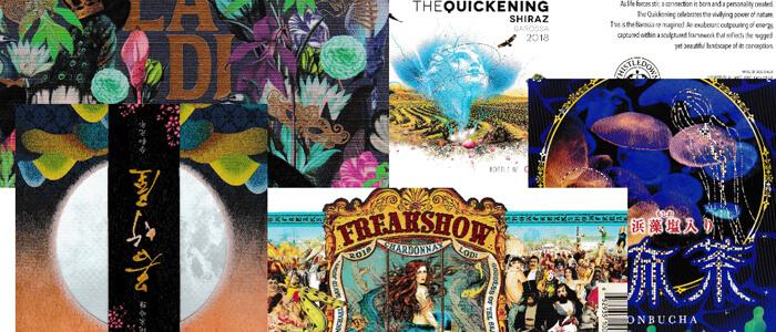
The winner is Multi-Color Corporation North America Wine & Spirits, USA for Freakshow Chardonnay.
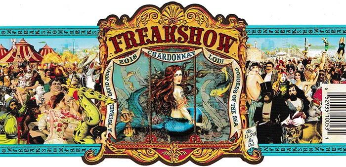
This is an exceptionally busy label showing a whole range of characters that might have been found in a fairground many years ago. With the central under water theme featuring a mermaid there is something to catch most people’s interest. The combined use of gold ink and cold foiling creates a great framework for the central theme of the label.
Digital Printing submitted by FPLMA (Australia)
The winner is Multi-Color Corporation, Australia for The Quickening
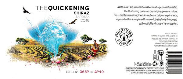
The design of this label encompasses the quickening which is associated with new life. In this case the blue life force spirit is seen emanating from the soil of the Barossa area in Australia with the ethereal lines highlighted using silver hot foil. The story is included in the design of the label which is printed on a slightly cream paper substrate which softens the impact of the landscape illustration.
L9 World Label Association submitted by FPLMA (Australia)
The winner is Jamesprint, Australia for La Di Da Malbec
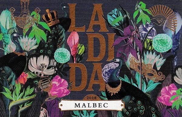
The more one looks at this label the more can be found in the design. There is the hint of a masked ball of yesteryear created by the gold chandelier, bow tie, face mask and fan highlighted using cold foiling. If you look hard you will see two peacocks one nicely highlighted using a gloss spot varnish. The plethora of different coloured flowers all adds to the intricate design of this label.
Letterpress Printing submitted by JFLP (Japan)
The winner is Shinwa Label Printing Co. Ltd, Japan for Konbucha
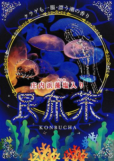
A delightful underwater theme for this label is enhanced by the use of a deep blue surround punctuated with sea plants and a central illustration of life in an aquarium. The extensive use of silver foiling adds a high degree of interest to the overall design. A label designed to attract the interest of the viewer.
Combination Printing submitted by JFLP (Japan)
The winner is Maru-sin Co, Ltd, Japan for Wakatakeya Brewery
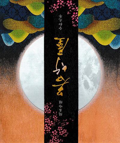
This sake label commemorates the first year of the Reiwa era. The design shows the moon which can be seen all over the world and by looking through the label the craters of the moon can be clearly seen. The hills in the foreground represent the current position from which the moon is being viewed. The whole label is printed on a wood simulated substrate. The concept of the label is that people who drink cold sake from the Wakatakeya Brewery and people watching the moon can expect to have a peaceful existence. The technical quality and the intricate designs of these labels shows exactly why they have been judged as the best in the world.

